Eric's Design Lab
Crystal Lake - Chicago Based Graphic Designer
Eric is a Graphic Designer based in Crystal Lake and the Chicago area. focusing on authenticity and the details in his work, Eric creates striking and unique designs and never settles for “good enough”. Every challenge is a new learning experience, if you never lose, you never learn.
Always Growing
|
Always Growing |
Always expanding
|
Always expanding |
Gallery
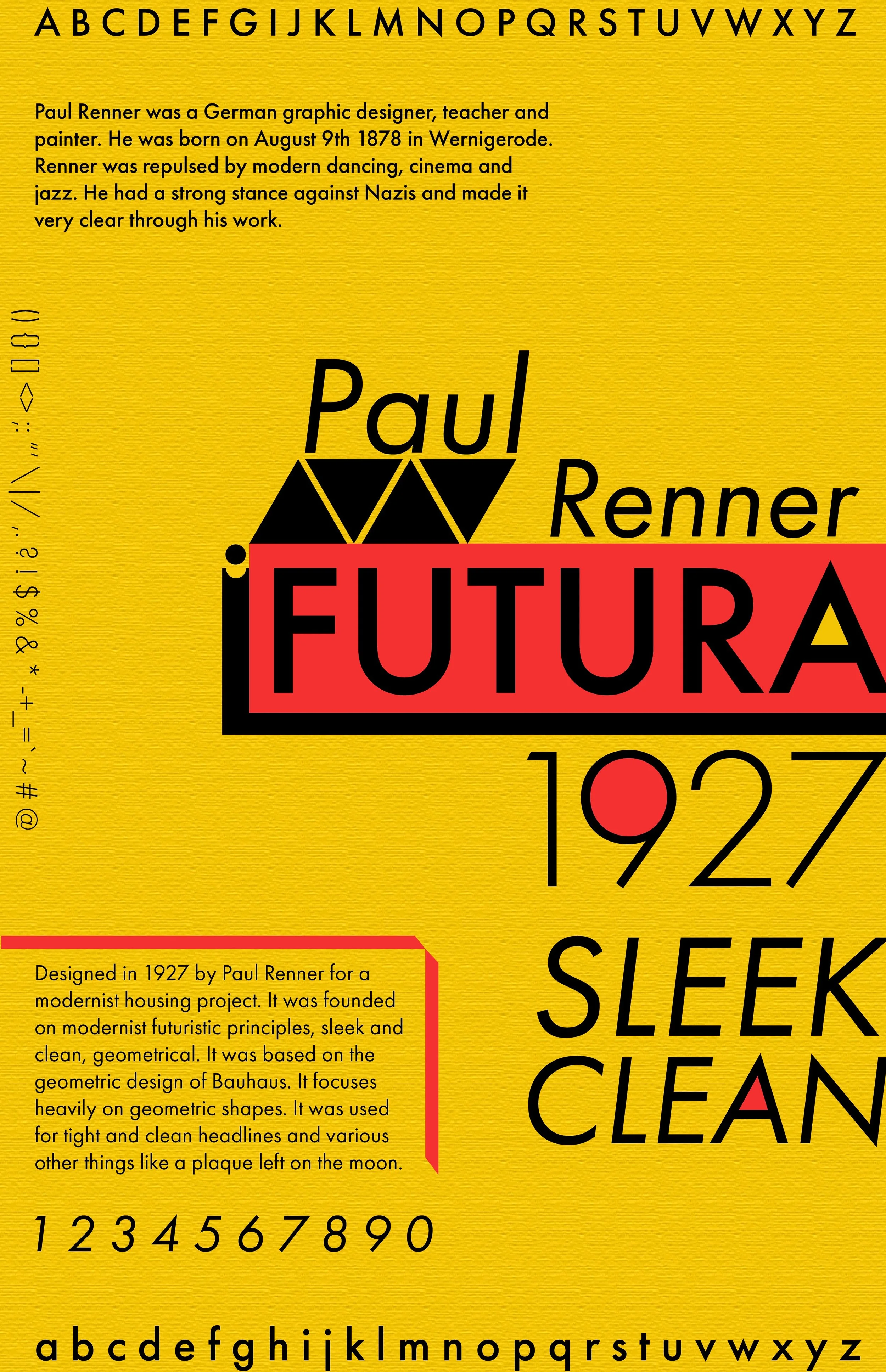
Designed to highlight the features of Paul Renner’s Futura font, strong geometry, sharp edges, bold legibility. The bold nature of its edges and shape lends itself to the inspiration Renner drew from, the German Bauhaus visual style popular in the early 1900’s.
FUTURA TYPE POSTER
The Neighbors in Need event was established to support homeless individuals in McHenry County, providing essentials such as food, water, clothing, showers, employment services, and other resources typically inaccessible to them. The client requested a logo that would represent the event. I aimed to capture both the warmth of their mission and the gravity of the cause, creating a design that conveys the event’s significance and compassionate intent. To respect the serious nature of homelessness, I avoided overly soft or lighthearted elements, ensuring the logo reflected the importance of this issue.
Font - Bebas Neue Bold
Neighbors in need logo
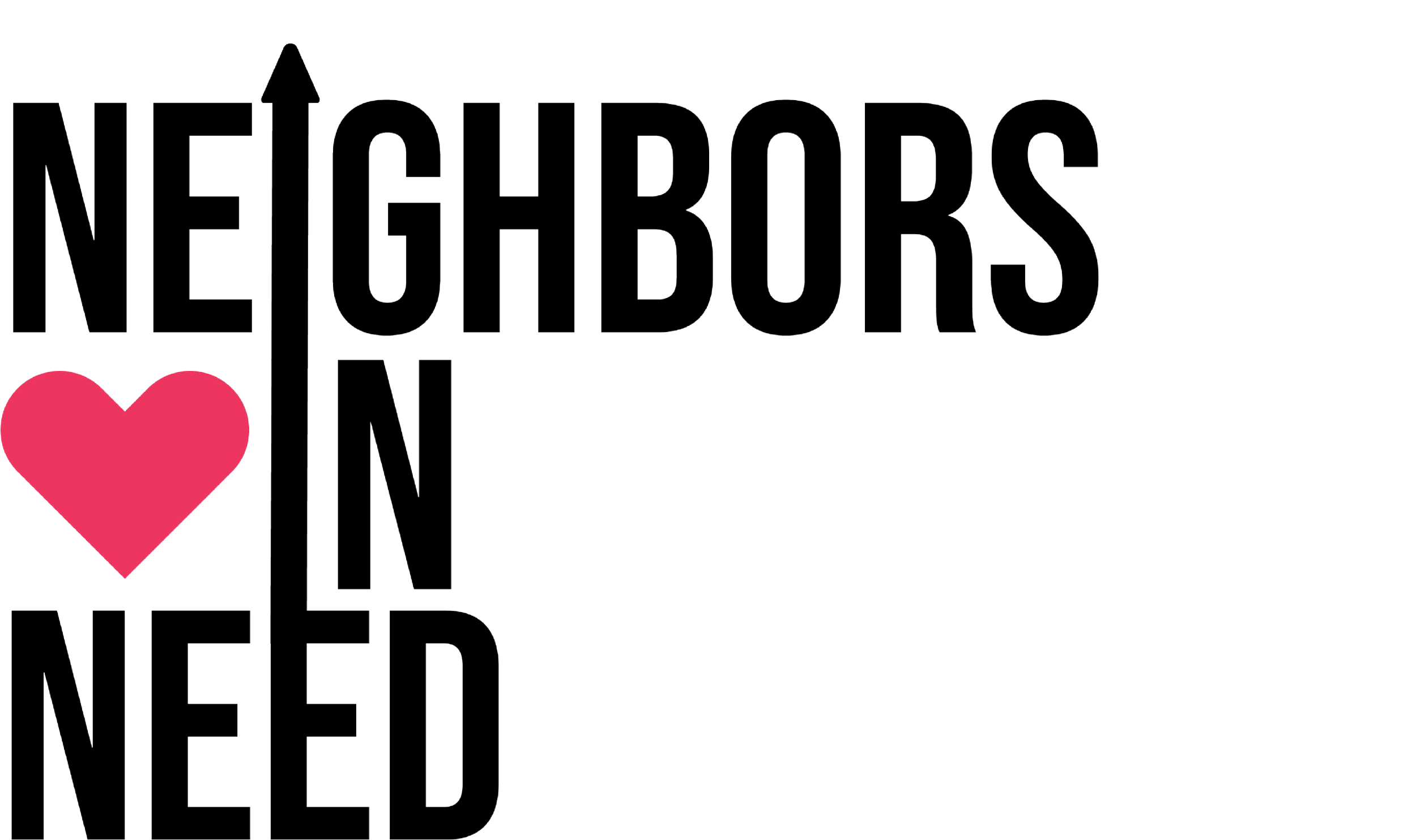
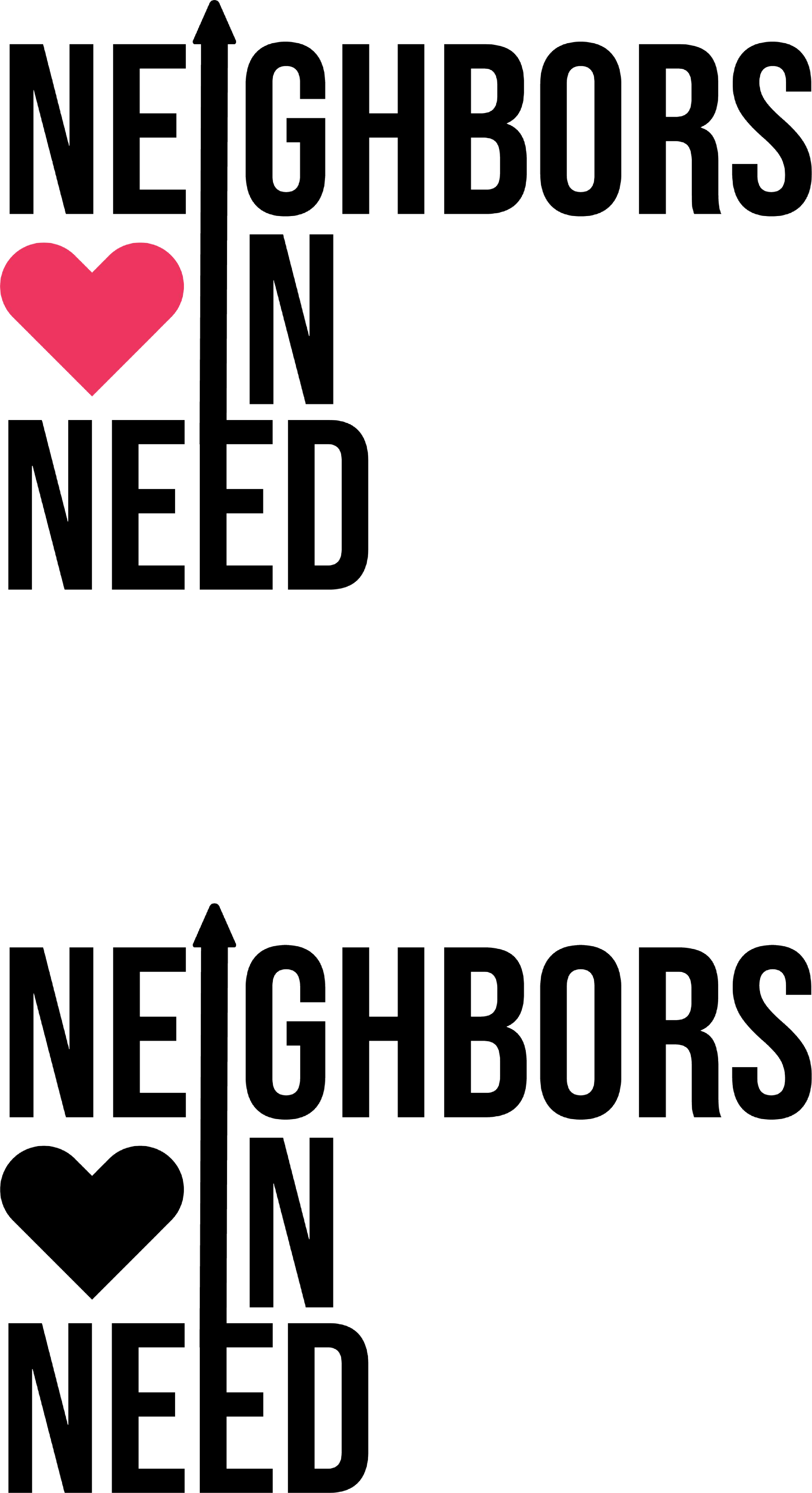
Simplistic without being boring
Arrow Uplifts
Connected line creates unity to show community and togetherness
Straight lines show importance and confidence
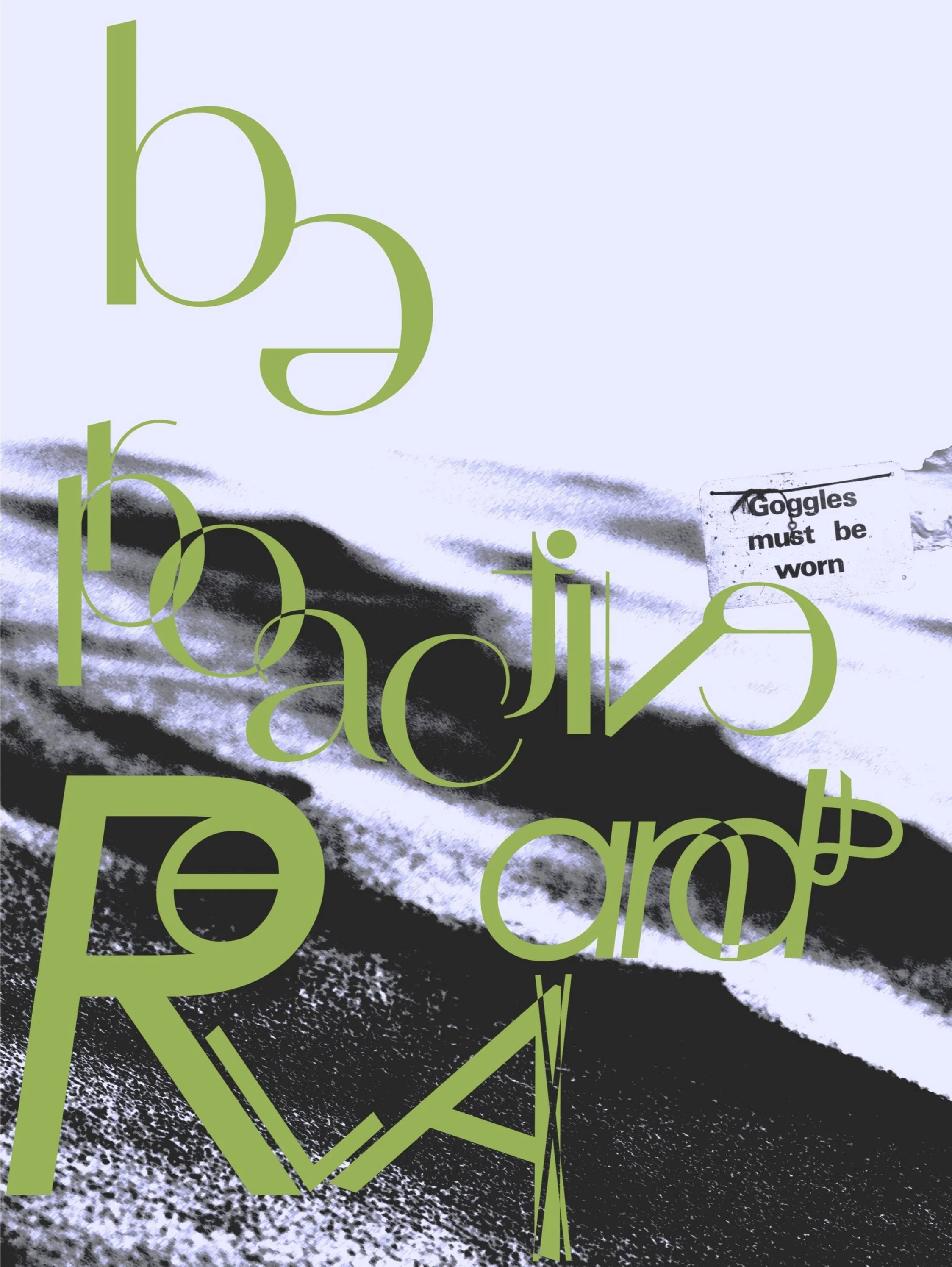
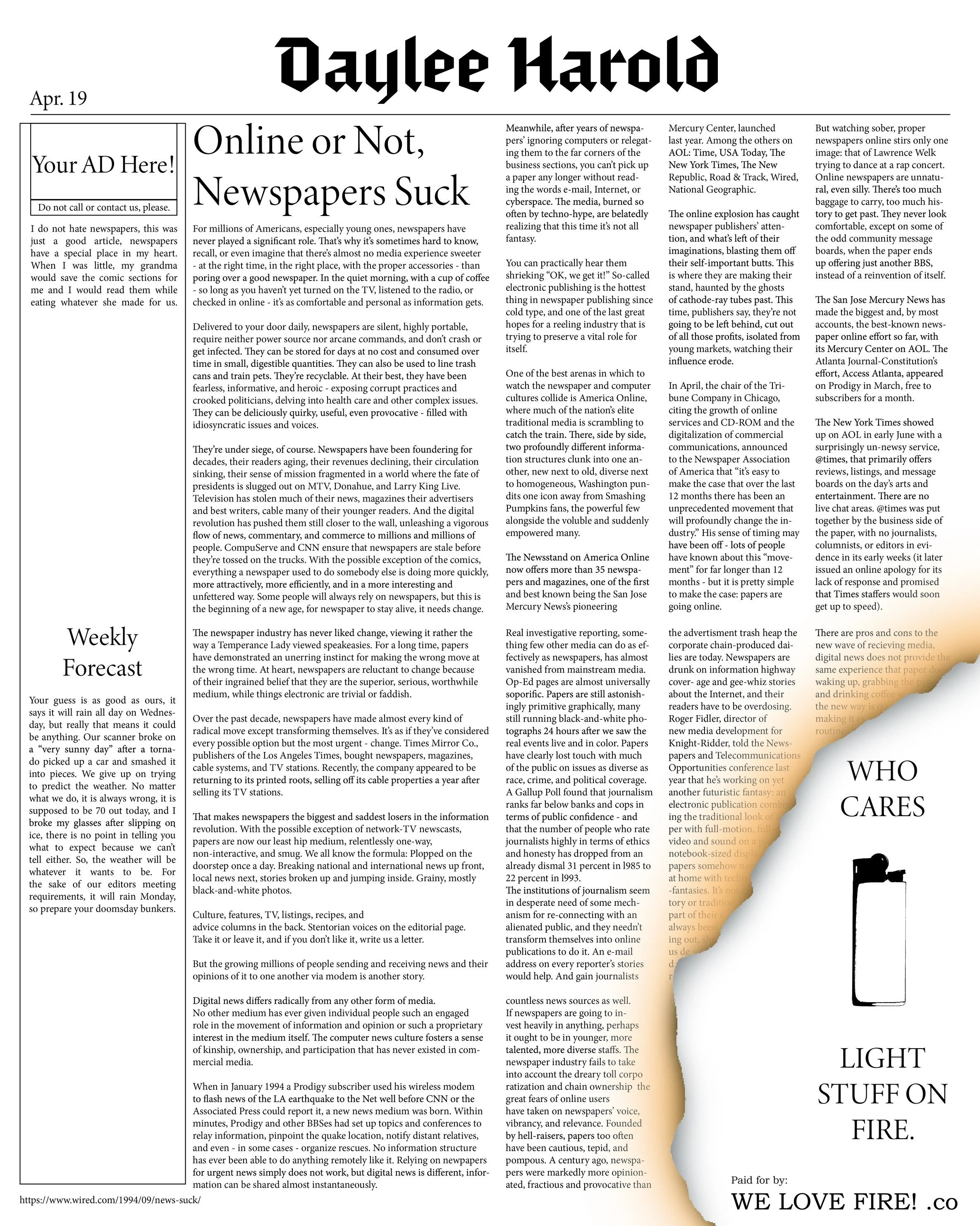
Newspaper advertisement
Typography project focusing on large body type layout and visual hierarchy. Intended the tone to be lightly snarky and ironic. Focused on using type as a shape more than as a way to communicate ideas to relate to the purpose of graphic design, use visual elements to communicate ideas.
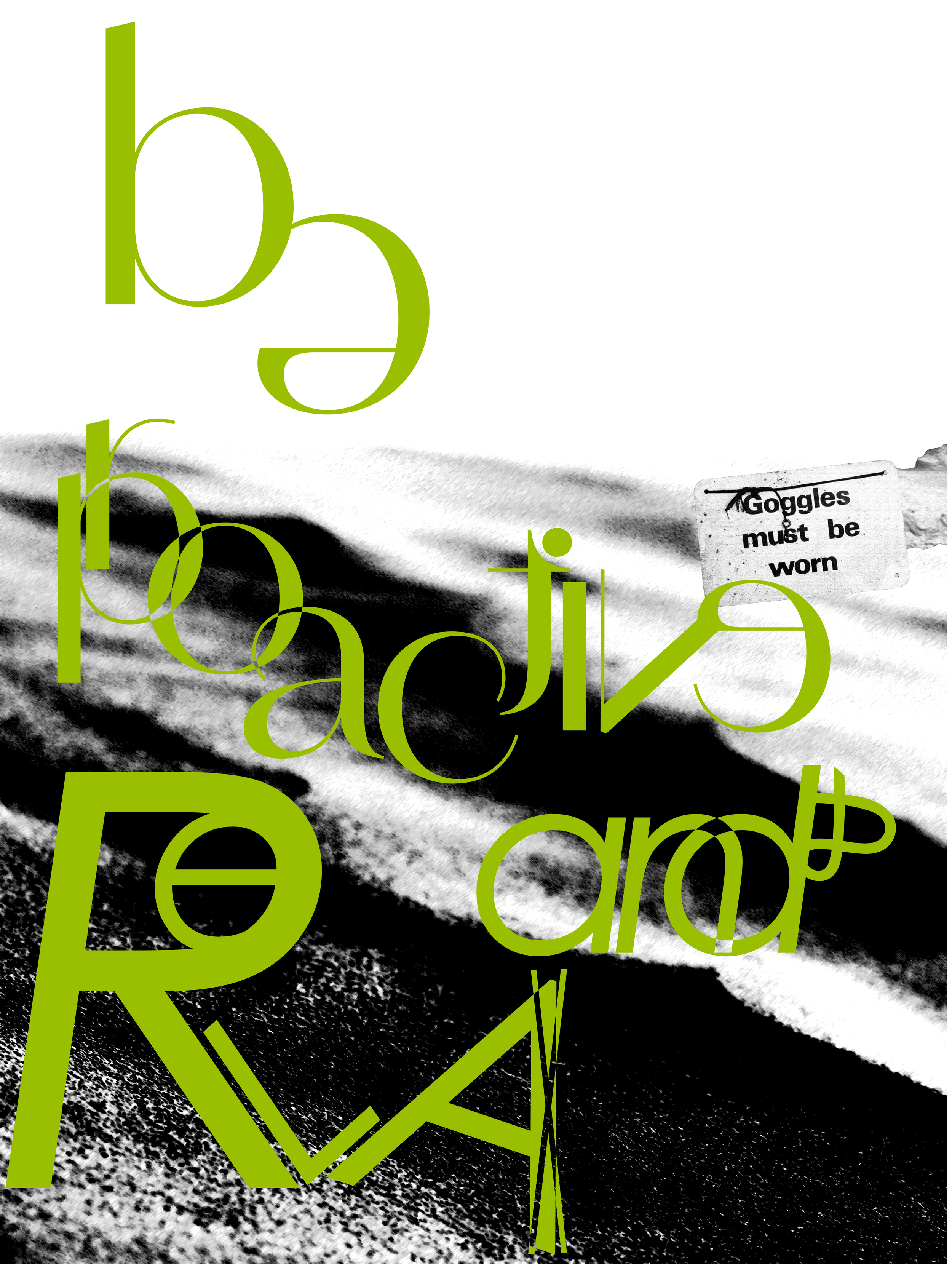
be proactive and relaX / / WIP